
animation 속성
1. animation-name
- 요소에 적용할 애니메이션이 설정된 @keyframes 추가 규칙의 이름 설정
- string : @keyframes 추가 규칙의 이름 설정
2. animation-duration
- 애니메이션이 진행되는 데 걸리는 시간을 설정
- time (default 0s) : 시간 단위 (s, ms)를 사용해 설정
3. animation-timing-function
- 애니메이션을 진행할 때 적용할 시간에 따른 속도의 변화 함수를 설정
- ease (default) : ease 함수로 설정
- linear : linear 함수로 설정
- ease-in : ease-in 함수로 설정
- ease-out : ease-out 함수로 설정
- ease-in-out : ease-in-out 함수로 설정
- cubic-bezier() : cubic-bezier 함수로 설정
4. animaition-delay
- 애니메이션을 시작하기 전에 지연을 결정
- time (default 0s) : 시간 단위 (s, ms)를 사용해 설정
5. animation-iteration-count
- 애니메이션 반복 횟수 설정
- number (default 1) 반복 횟수를 숫자로 설정
- infinite : 애니메이션이 무한하게 반복하도록 설정
6. animation-direction
- 애니메이션이 진행될 때 진행 방향 설정
- normal (default) : 애니메이션이 순방향으로 진행되도록 설정
- reverse : 애니메이션이 역방향으로 진행되도록 설정
- alternate : 애니메이션이 순뱡향으로 진행되도록 하고, 다음에는 역방향으로 진행되도록 설정
- alternate-reverse : 애니메이션이 역방향으로 진행되도록 하고, 다음에는 순방향으로 진행되도록 설정
7. animation-fill-mode
- 애니메이션 실행 전과 실행 후에 요소에 스타일을 적용하는 방법을 설정
- none (default) : 애니메이션이 진행되는 동안이 아니면 @keyframes 추가 규칙에 설정한 스타일을 적용하지 않도록 설정
- forwards : 애니메이션의 마지막 키프레임에 설정한 스타일을 유지하도록 설정 (마지막 키프레임은 animation-direction 속성과 animation-iteration-count 속성의 값에 따라 달라진다.)
- backwards : 애니메이션이 적용되면 첫 번째 키프레임에 설정된 스타일이 적용되고, animation-delay 시간 동안 이 스타일을 유지하도록 설정 (첫 번째 키프레임은 animation-direction 속성의 값에 따라 달라진다.)
- both : forwards 설정과 backwards 설정을 모두 적용
8. animation-play-state
- 애니메이션의 진행 상태 설정
- running (default) : 애니메이션이 진행되도록 설정
- paused : 애니메이션을 멈추도록 설정
● animation
- 애니메이션과 관련된 스타일 속성들의 값을 한꺼번에 설정
|
animation : <animation-name> || <animation-duration> || <animation-timing -function> || <animation-delay> || <animation-iteration-count> || <animation- direction> || <animation-fill-mode> || <animtion-play-state>; |
<!DOCTYPE html>
<html>
<head>
<meta name="viewport" content="width=device-width">
<meta charset="utf-8">
<title>demo</title>
<link rel="stylesheet" href="reset.css">
<style>
/* 문제 설명
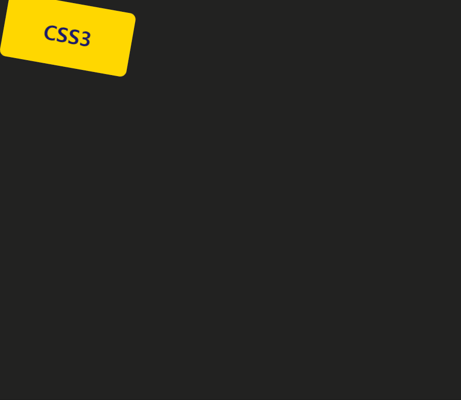
다음과 같은 상자를 표시하는 HTML 문서를 작성하라
1. 높이 100px, 너비 200px, 모서리 반경 10px, 내부 문자 CSS3
2. 배경색 gold, 글자 색상 midnightblue
위에서 작성한 상자가 10초 동안 움직이는데 시간의 변화에 따라 다음과 같은
움직임을 보이도록 스타일 시트를 작성하라
1. 처음: 화면 좌상단에 위치
2. 2초 후: 화면의 우상단에 위치, 배경색 yellowgreen
3. 5초 후: 화면의 우하단에 위치, 배경색 hotpink
4. 8초 후: 화면의 좌하단에 위치, 배경색 yellowgreen
5. 10초 후: 화면의 좌상단에 위치, 배경색 gold
*/
body {
background-color: #222;
overflow: hidden;
}
#box {
width: 200px; height: 100px;
border-radius: 10px;
background-color: gold;
color: midnightblue;
text-align: center;
font-size: 2em;
font-weight: 900;
line-height: 100px;
position: absolute;
animation: box 10s infinite;
}
/* keyframes 규칙에서는 각 키프레임에 같은 스타일 속성을 설정해야 한다. */
@keyframes box {
from {
background-color: gold;
top: 10px; left: 10px;
transform: rotate(10deg);
}
20% {
background-color: yellowgreen;
top: 10px; left: 87%;
transform: rotate(60deg);
}
50% {
background-color: hotpink;
top: 88%; left: 87%;
transform: rotate(-360deg);
}
80% {
background-color: yellowgreen;
top: 88%; left: 10px;
transform: rotate(360deg);
}
to {
background-color: gold;
top: 10px; left: 10px;
transform: rotate(10deg)
}
}
</style>
</head>
<body>
<div id="box">CSS3</div>
</body>
</html>